Slack Technologies
June - August 2017, Product Design Intern, San Francisco
Challenge
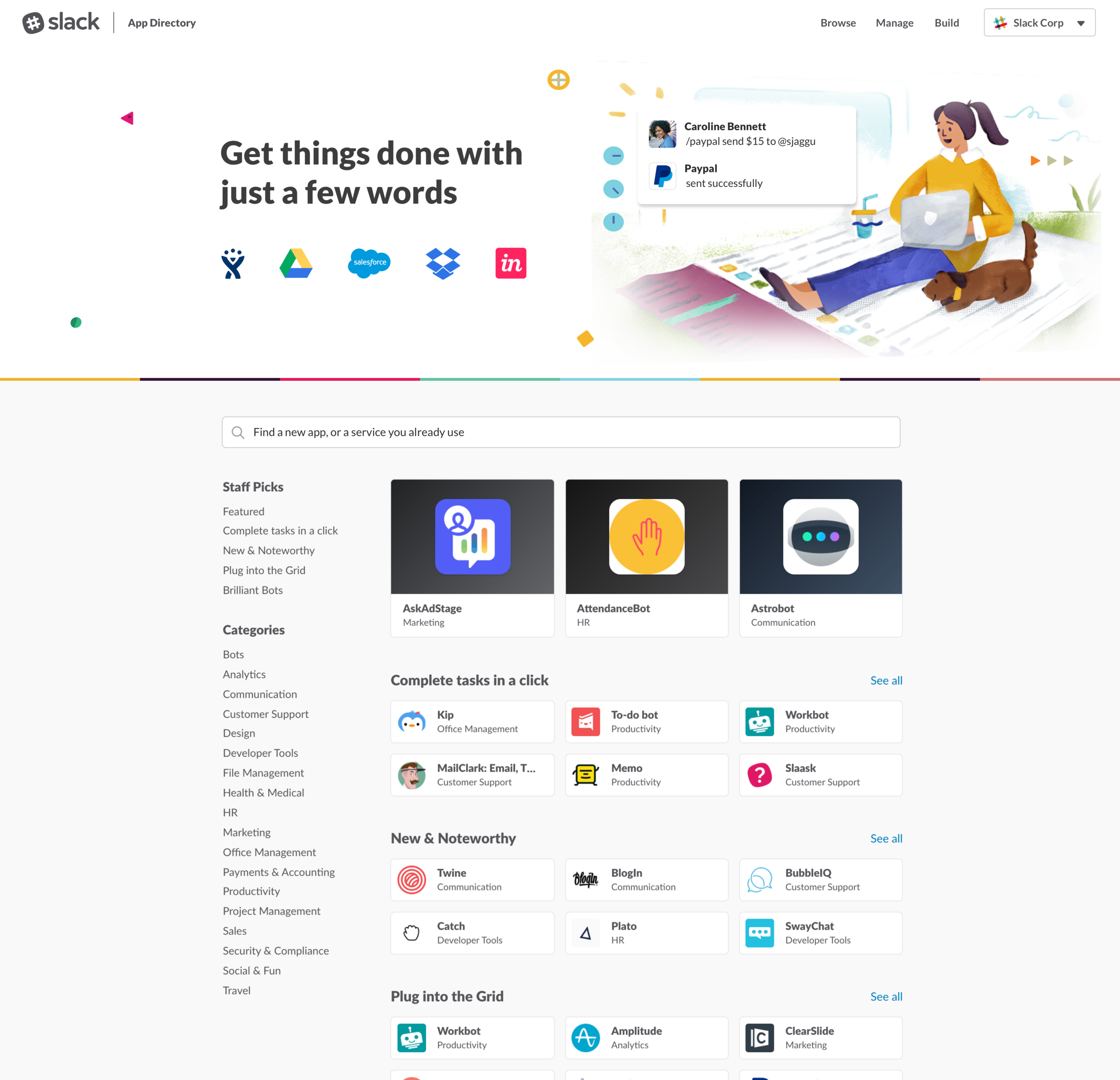
Traffic and attention to the App Directory homepage has increased due to the release of app space feature in the Slack client, meaning that more first-time app users will land on the homepage. When a user lands on the Slack App Directory for the first time, it is difficult to know what to do first. The featured apps are often new and noteworthy, and there is no way to know which apps to start with. There is no information about what apps customers should install first.
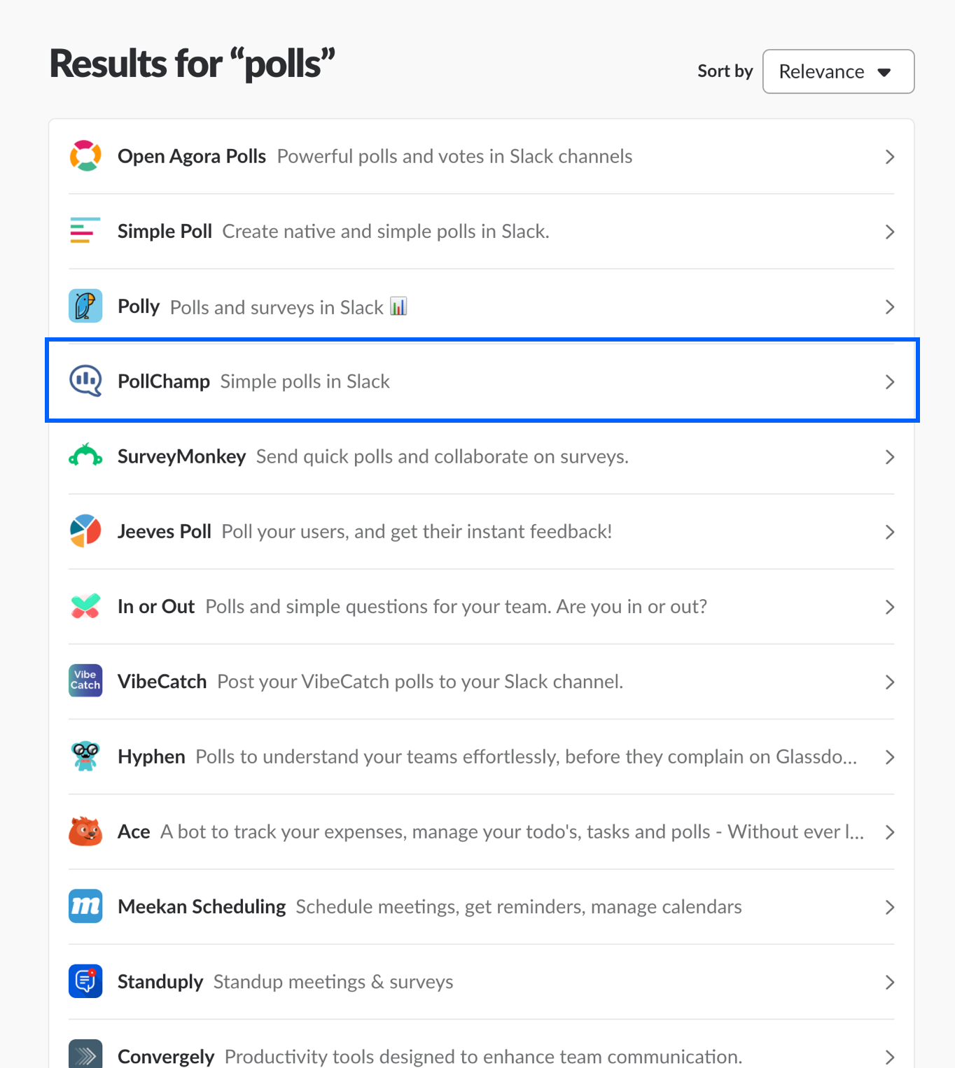
The homepage is targeted for users who are already familiar with apps. Also, there is no way to measure relative quality between apps. The app card displays only the logo and description which doesn't help much for the user to decide to click.
Role
Guided the open-ended problem area by identifying a wide range of potential directions and collaborated with a Researcher, Content Strategist, Engineer and Product Manager.
Built a variety of prototypes for web, tablet, and mobile. Responsible for creating end-end experience starting from research to handing over visual specs to Engineer.
The homepage launched globally on September 20th, 2017.
Design Goals
1. User with no knowledge of apps should understand how apps can benefit them in Slack
2. Show the relative quality of an app and how it can solve the user needs
Understanding the Problem
At the outset of the project, I didn’t have a clear mission or specific goals. But once I started exploring the pre-existing insights by interviewing users and partnering with our researcher, I understood how users were getting around the website and the pain points.
Other than user research, I have taken a deep dive into Google analytics and competitive research.
Early Insights
Tested the existing App Directory with nine participants, four of them are familiar with App Directory and five participants are novice users. The goals were to understand the challenges users faced and the workarounds they employed.
Confused about apps
Novice users were confused about what apps do. Users generally browse the page to find out familiar brands that they use for work. Most of the users expected to see visual information about how apps work in real-time.
Control to take decisions
Users were unsure about which app result to click and expected to see some video which helps them understand whether a particular app works for their team.
User wanted to install an app only if they felt secure and want to see how apps work in real-time.
UX Flow
There are three types of users with three different goals and usually lands on the app directory home page. Let's see the user types:
- Users who come from the Slack desktop app are the people who want to explore and browse apps.
- Users who come from permission tab in the Slack desktop app are focused on managing particular app permissions.
- Users who come from developer website are the ones who want to install or want to know more about the app.
So, this flow helped me figure out that the target audience is the people who come from the Slack desktop app–app space.
New Opportunities
Type 1: Users first time experience
Once I figured out the target audience and pain points, I came up with a lot of questions that the design should address to communicate and help users understand the value of apps. For each question, I had a bunch of ideas to solve the problems.
How do we want to introduce the users to app integrations, bots, and slash commands?
How do we want our users to feel as soon as they land on the page?
What do we want their first actions to be?
How much information about the app do we want to show on the home page?
What are the ways users can find an app?
Range of possibilities:
- Quick image tutorial to guide the user for the first time with skip options.
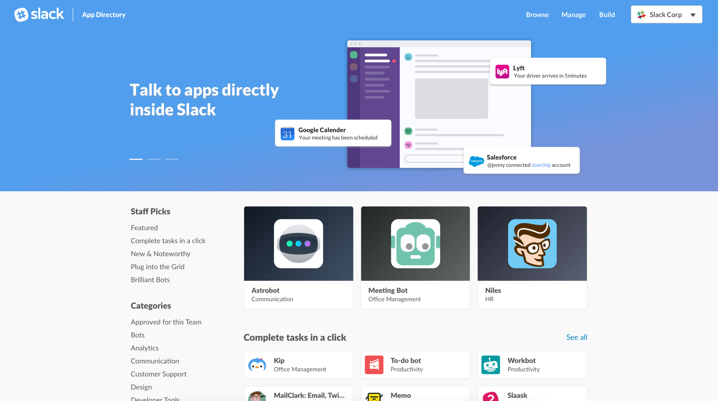
- Using the banner space, show information about app integration, bot users, and slash command.
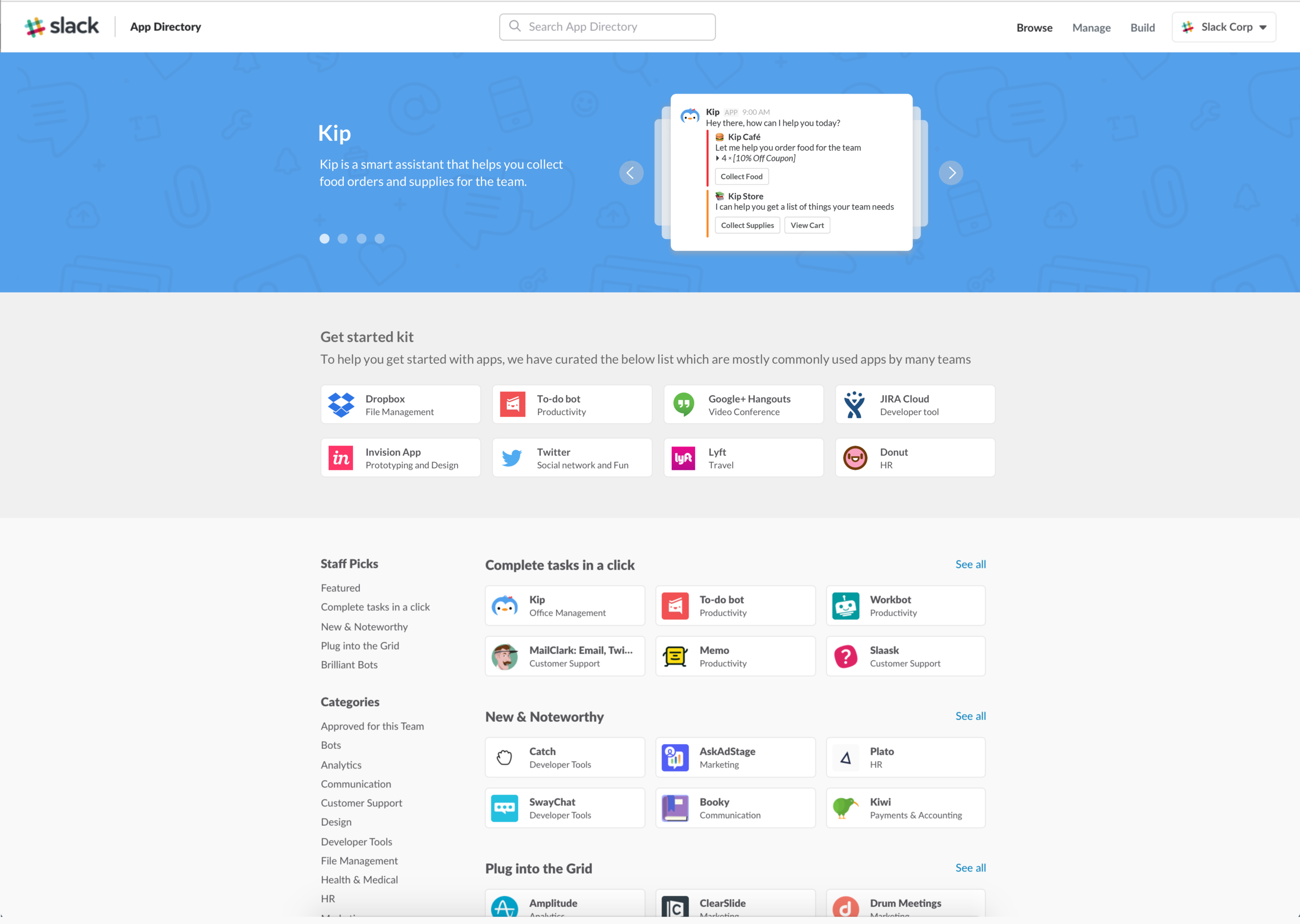
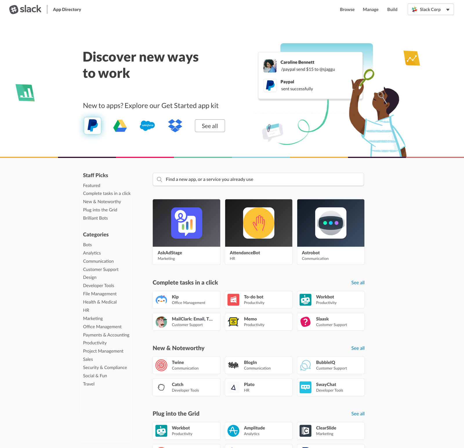
- App starter kit: A predefined group of more than one app that works well and most commonly used by many teams.
- Personalized suggestions based on their team or industry - when the user is logged in.
- Categories based on Industry, role, easy to try out and no setup required.
- Testimonials/case studies of companies who have been benefited from app integrations.
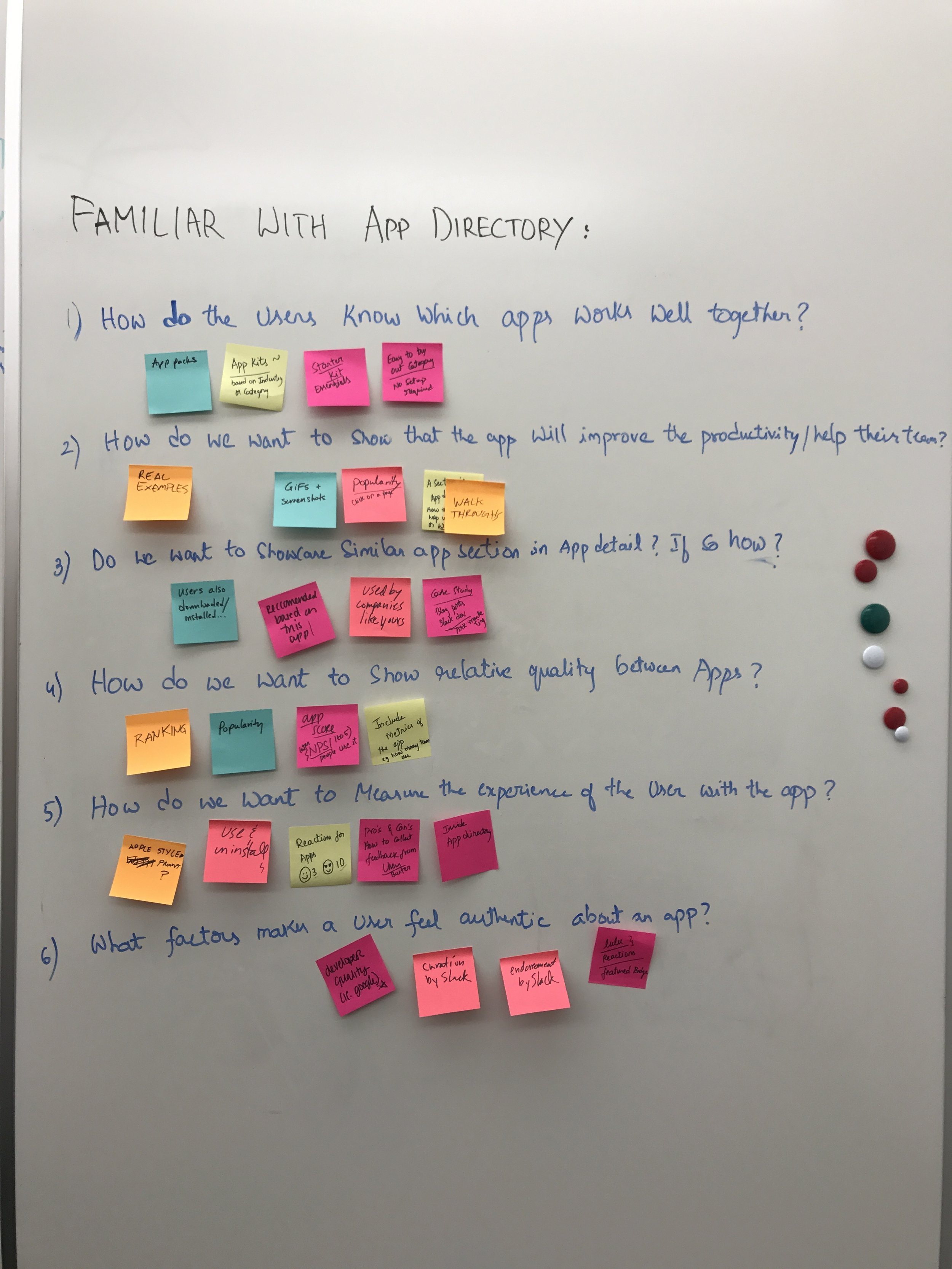
Type 2: Users familiar with App directory
How does the user know which apps work well together?
How do we want to show the relative quality between apps?
How do we want to show that the app will improve the productivity of their team?
What factors makes a user feel authentic about an app?What factors make a user feel authentic about an app?
Range of possibilities
- Badges for Apps - staff picked, build by slack, etc.
- App walkthroughs - screenshots, videos, problems app will solve.
- Add reactions to the apps.
- Include case studies of other companies who are using this app.
- Developer information
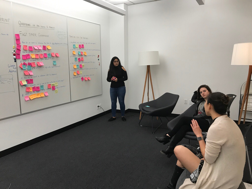
Directional check with team
Finding out the right solution
After coming up with a wide range of possibilities, I have revisited background research which helped to figure out the ideas which create a lot of impact and solves the problem efficiently.
User education and helping users get started
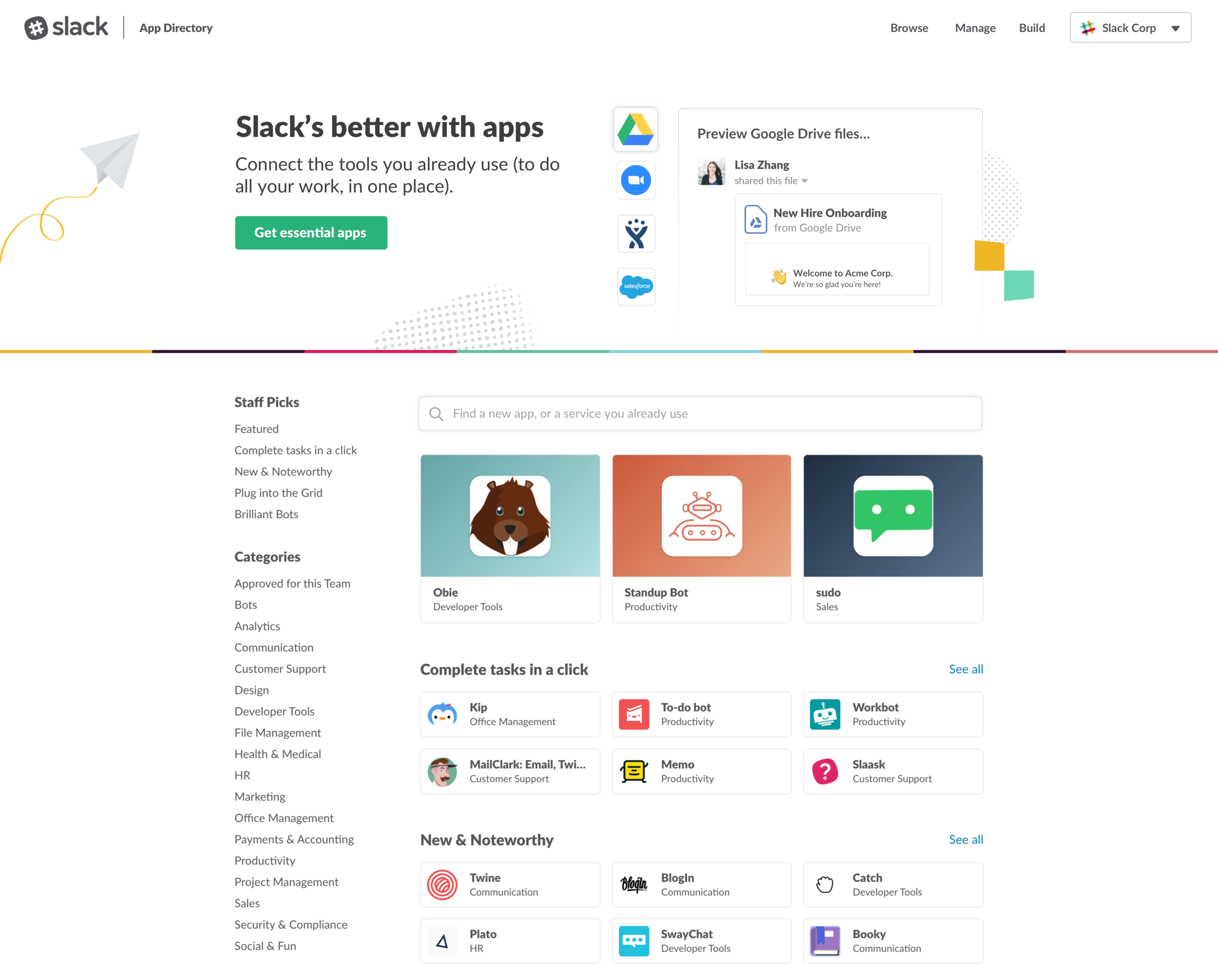
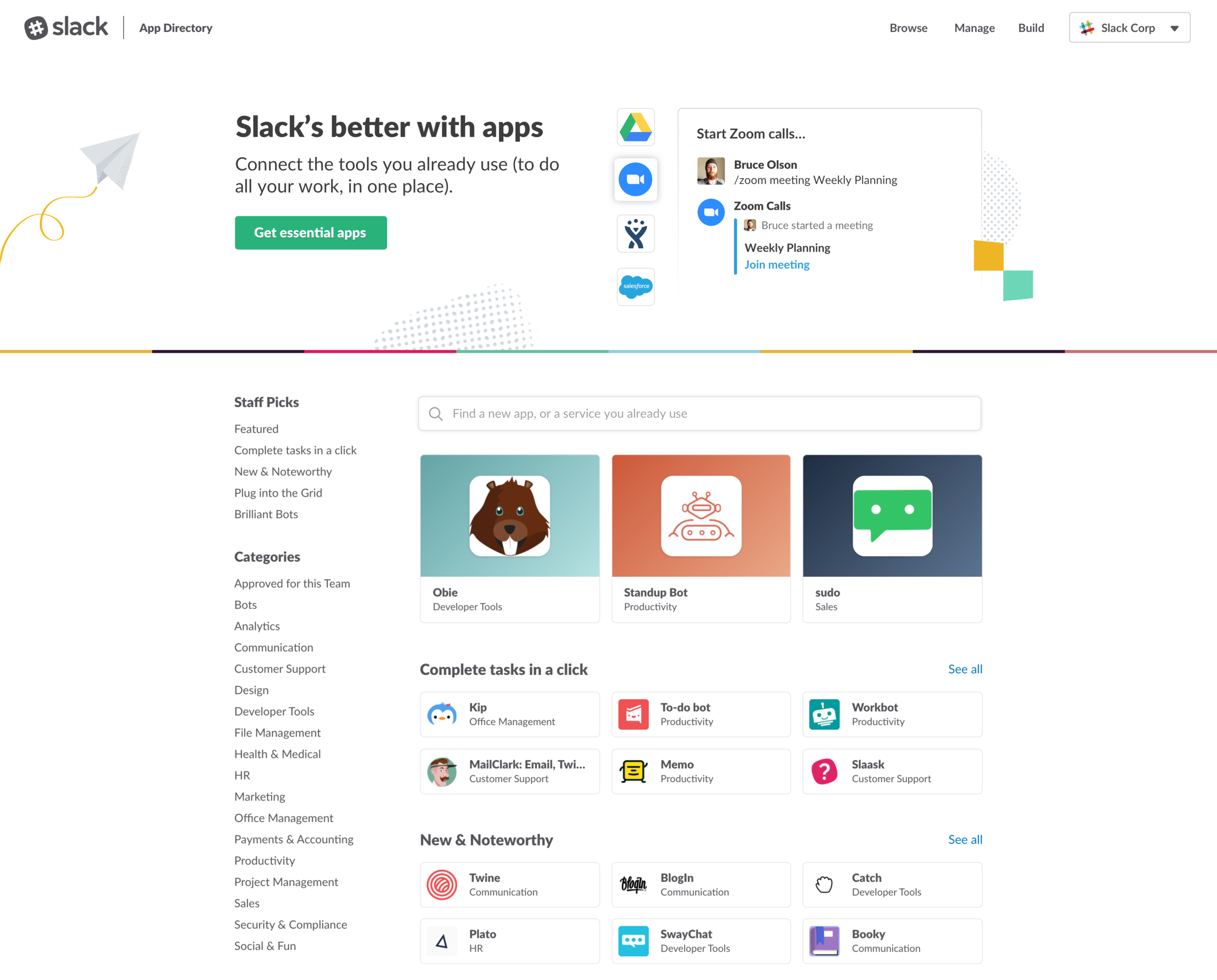
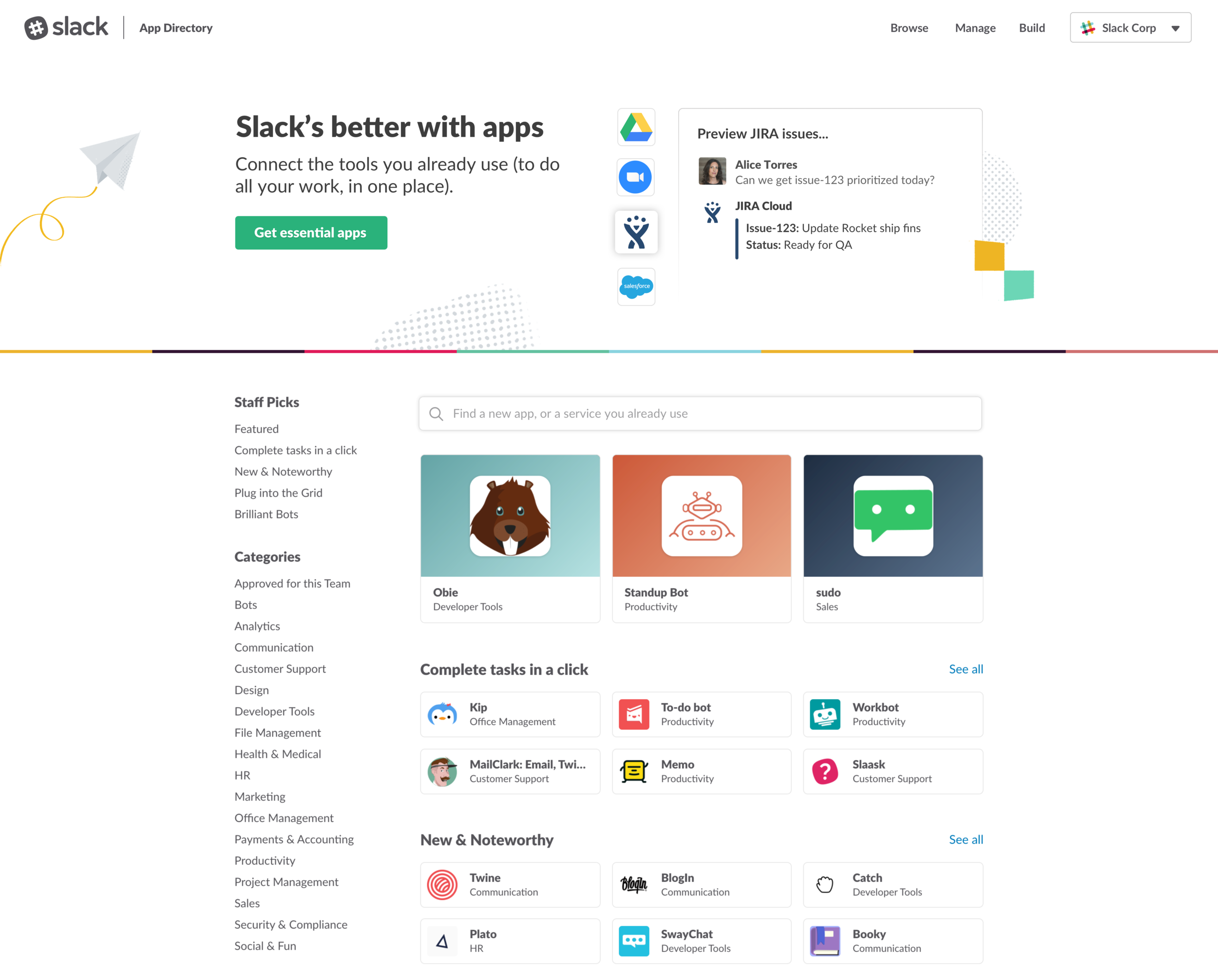
Banner space features prominent partners that people can quickly recognize with examples to help users immediately understand how apps work within Slack. The designs will animate and bring the use cases to life. They are being built so the examples can be easily updated in the future. The essential apps button will take users to the Essential Apps category with a shortlisted group of more than one app that works well and most commonly used by many teams.
Check out the live version here https://slack.com/apps
Impact: Its a good start but there is lot more to do
8.6% increase in clicks to install direct apps
Essential apps became the most visited category with 2x times page views
Iterations
Interested in learning more about this project, click here


